

Color grading has always been one of my favorite facets of cinematography. Think about the warm reds and oranges of Mad Max, or the darker hues of The Revenant. The ability of a colorist to alter the mood and feel of a film through hues and saturation is incredibly powerful. I’ve been wanting to make a color grading tutorial for years, but it wasn’t until about a year ago that I felt like I had learned enough to even consider doing it. I knew the time was right when I finished creating my video about my favorite picture profile for the A7Sii.
This is a modified version of my color grading workflow, and here’s why. Normally when I color grade I use Magic Bullet Looks from Red Giant, but I didn’t feel like making you spend 400 bucks on a program whenever you can do basically the same thing inside Adobe Premiere Pro CC. So everything in this tutorial happens in Premiere, using nothing but the Lumetri Color panel that’s already sitting there.
And that does not mean this only applies to wedding films shot with the A7Sii, or any other camera for that matter. The philosophy, the curves, and the color wheels should apply to any video you are color grading, regardless of its content. If you can understand curves and color wheels you can grade anything, in any software, so those two things are what we’re going to spend most of our time on.
You will need a copy of Premiere Pro CC to follow along. Adobe offers a free trial of Creative Cloud with all their apps, including Premiere Pro, and you can download the trial here.
Before You Start: Calibrate Your Monitor
I hope and pray that you are doing your color grading on a color calibrated monitor. Now, you can go out and spend thousands of dollars on some fancy 10-bit monitor that’s made for color grading, but I haven’t even done that. If you’re poor like me, all I use for color grading is a basic Dell monitor that I bought a Spyder color calibration tool for.
The reason I’m recommending this is that if you do not calibrate your monitor, you have no way of knowing whether your colors are correct. Even if you bought some brand new iMac and it looks beautiful, the colors still might not be accurate. Your eyes will lie to you, too. Before I calibrated my monitor I thought it looked fine, and then I did it and I was like, that looks completely different, did I really think that looked good?
Another thing to consider is that most monitor manufacturers skew their colors to a cooler blue tint, because they know the monitor is most likely going to get used in a workplace with harsh fluorescent lighting while you type away in your cubicle on your Excel spreadsheets. That blue tint is not something you want translating over into your color grade. Calibration brings you back to a neutral look that will hold up across most screens.
So please, please calibrate at some point, because if you’re delivering a video to a client who paid for it, you want it to look as good as possible. That’s the whole reason we’re color grading. I just don’t want you ending up with a grade that looks beautiful on your monitor and terrible on everything else, where you’re telling the client no, no, come to my house, watch it on my monitor, it looks great here, don’t ever watch it any other way. You don’t have to do that.

The other recommendation is to watch my video on my favorite A7Sii picture profile first. Spoiler alert: it’s PP8, with the Cine4 gamma and the S-Gamut3.Cine color space. If you shoot some footage in that profile and then bring it into Premiere, your footage is going to line up almost exactly with the footage I’m working on here, which makes following along a whole lot easier.
Get Philosophical First
Before you touch a single slider, I want you to think about what mood you want to express in your film, because color grading is all about setting a mood. And that can vary completely depending on your couple. Are they bright and happy? Are they in a country setting? Are they getting married on top of a skyscraper? All of those locations and moods and emotions can dictate where you go with your grade.
I also want you to think about the look you want your work to represent. Ideally, someday in the future, someone will be watching one of my videos and go, hey, that looks like one of Matt Johnson’s videos, I recognize that grade. It hasn’t happened yet, but you know, I can hope and dream.
We already do that with other people. Think about the first season of Daredevil, which has this yellow and purple look that’s so unique you can watch it and immediately say, that’s Daredevil. Or for a more extreme example, think about Michael Bay. All of his movies look the same. Super high contrast, high saturation, skin tones like orange popping out at you. You see it and you say, that’s Michael Bay, that’s a summer blockbuster. I’m not advocating doing exactly that, but having a look that’s recognizable can be incredibly powerful.
I’d also recommend learning about complementary colors, because there’s a whole science of color that goes along with the art of color, and knowing both will make your grading better. We’re going to use complementary colors later in this tutorial without me making a big deal about it.
Premiere Pro CC and Your Hero Shot
This is Premiere Pro CC, and just for clarification, I’m using the 2015.2 release. I’m going to assume you already know how to import footage and create a timeline, because if you don’t, we’ve got a lot more basics to cover first. So we’re going to pretend your film is already edited and you’re ready to grade it.
First, scroll through your edited film until you find your hero shot. The hero shot is the shot you believe most exemplifies your film. Ideally it has a lot of highlights, a lot of shadows, and it really shows off this is what my film looks like, this is what it’s going to be. The shot I picked has a great variety of shadows, highlights, and midtones, and it also exemplifies the wedding. This is Katelyn and Paul. They got married outdoors in December, and it was beautiful weather, because this is Texas and it doesn’t really get wintry here. Thankfully.
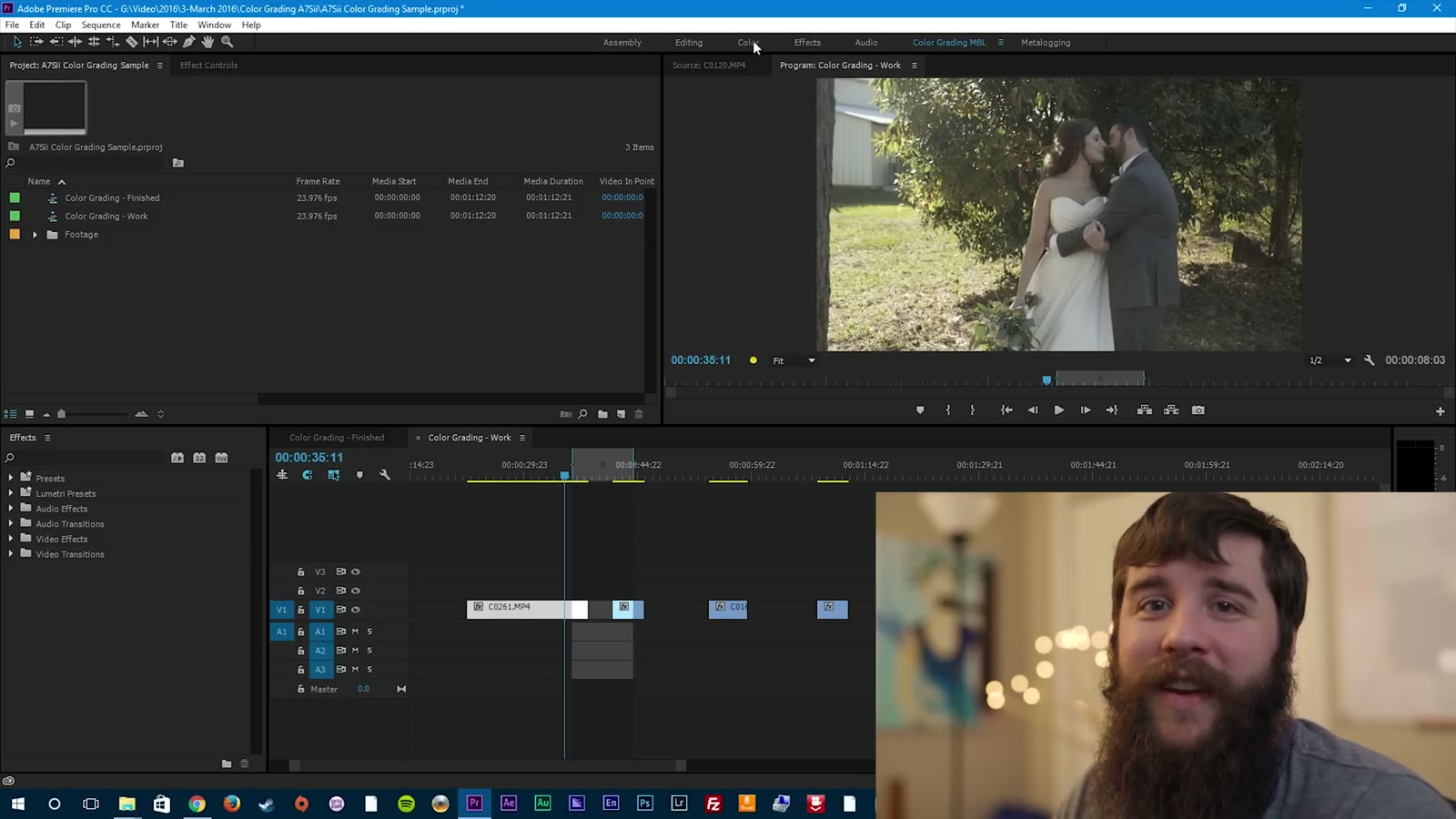
Go up to the Color tab, which is one of the best things Adobe ever added to Premiere in my opinion. Select Color and you’ll get the whole Lumetri Color window. It might be in a different spot on yours, but it’s got Basic, Creative, Curves, Color Wheels, and Vignette. The only two we really need to concern ourselves with are Curves and Color Wheels.
Now that I’ve said that, we’re actually not going to start there. Go to Basic Correction first, because before I do any other grading I like to boost the saturation a little bit. This is a pretty flat image, so I’m going to bring saturation up to about 130. It doesn’t have to be precise. It’s just so I can understand the colors I’m working with and get a good idea of where I want to take the grade.
And here’s where the philosophy comes back. Katelyn and Paul are good friends of mine. They’re in my Bible study group, we hang out pretty often, and they are some of the most fun, happy-go-lucky people I know. Whenever I think about them I think bright colors, good saturation, warm and inviting. Even though it’s December, which you’d think means cold, this is Texas, so it’s a beautiful blue sunny day. For their wedding film I want them to look back and say, man, that was a happy and fun day, and I want the grade to push that further. I don’t want just the editing to say that was fun. I want them to watch the grade and feel it.
Curves: Shadows, Midtones, and Highlights
Once your saturation is up a little so you can tell what you’re working with, go straight into Curves. This may look confusing, but it really isn’t, and I’ll make it as simple as I possibly can.
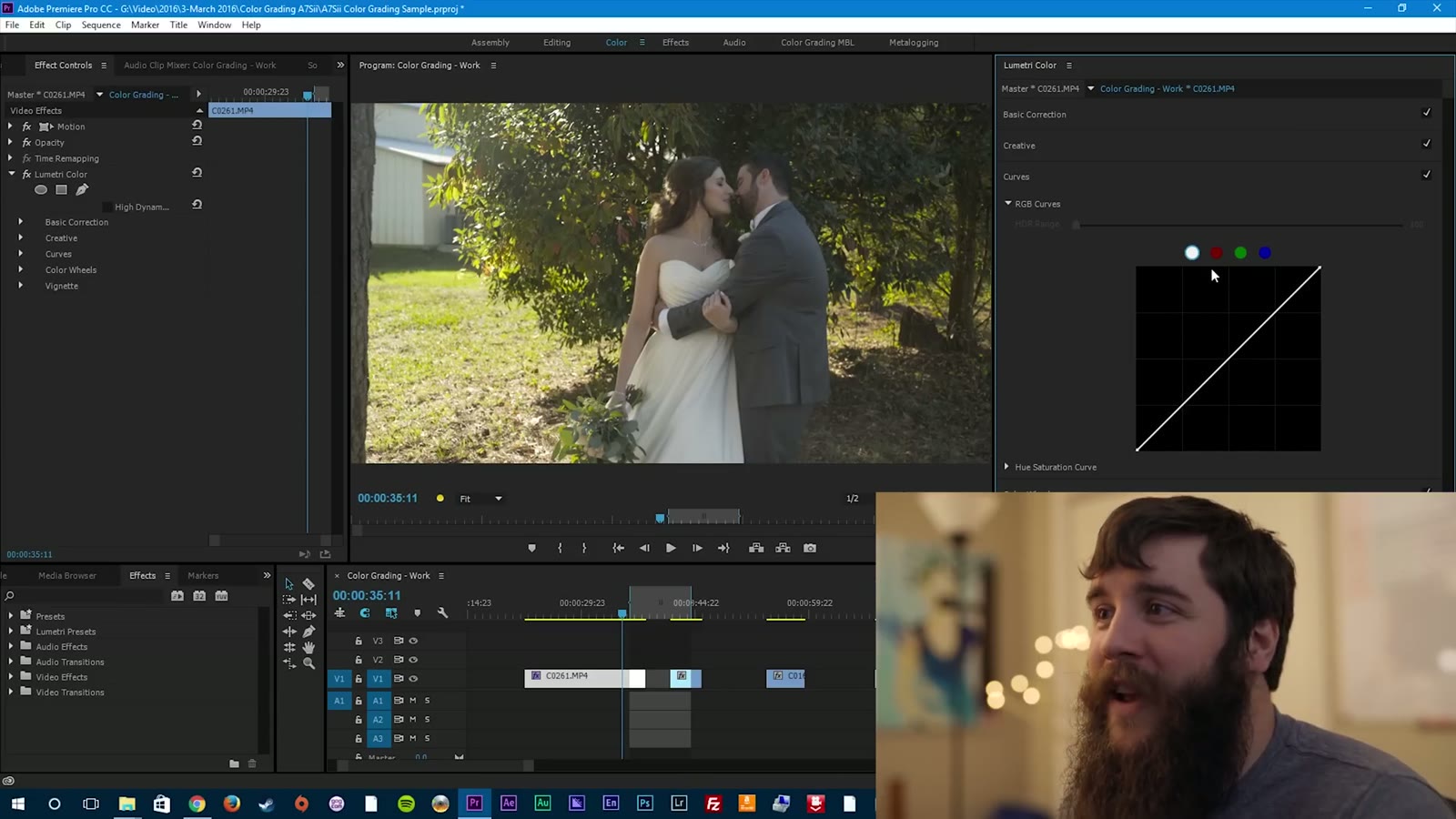
Start at the top. You have White, Red, Green, Blue. You may have heard of RGB before, because red, green, and blue are the basis for all other colors. White is considered all colors, which is why it’s selected by default, and that’s what we want, because we want to affect the curve for every color at once.
So what is the curve? The curve is the brightness and contrast of your image, and it’s broken up into three segments: shadows, midtones, and highlights. If you remember one thing from this whole tutorial, remember that. Bottom left of the line is shadows, the middle is midtones, and the top of the line is highlights.
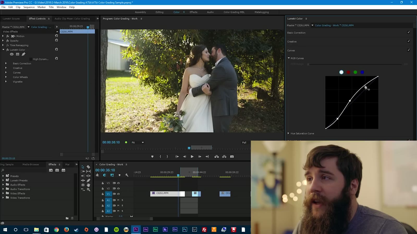
Click once on the line and it makes a little data point, then drag up and down with your mouse. Drag up on the bottom left and you bring your shadow level up. Drag down and you bring it down. At this point I want to crush the shadows just a little bit. And that’s one of the first things you learn about color grading: it’s a subtle art. You don’t want to go crazy. Start adjusting a ton and you end up with this digital black look that just looks awkward, or a crazy blown out look. Subtlety is key.
Something else that’s worth knowing here. The longer you look at an image, the more used to it you get. So if you’re ever sitting there going, man, I don’t know if this looks good or not, take a step away. Literally go spend five minutes doing something else, then come back and you’ll be able to say oh, that does look good, or it doesn’t. From what I’ve researched, you really only have about five to ten seconds to look at an image before it starts getting baked into your mind. Get a second opinion from someone else if you can.
Next, click in the middle and make another data point, and start adjusting the midtones. Midtones are usually where the majority of your skin tones live, so pay very special attention here, because this is what determines how people look in your image. You don’t want alien green people, or skin tones that are too dark and washed out, or so bright that everyone is glowing. You want something subtle and right in the middle that resembles film. I bring the middle up just a little and the skin tones start looking pretty good.
Lastly you’ve got your highlights. In this shot they were starting to look a little digital and baked, because the sun was so bright on the side of the frame, and that’s distracting. So click and create a third data point up top and drag those down a little. They go from digital-looking pop to something much more subtle, where the grass is still a little bright but it isn’t pulling your eye away from the couple anymore.
Color Wheels: Start With The Midtones
Now that you’ve adjusted the shadows, midtones, and highlights of your curves, it’s time to go to the color wheels. Same three segments, but this time you’re adjusting the color of each one instead of the brightness. Adjust the shadow wheel and it brings that color into the shadows, midtone wheel into the midtones, highlight wheel into the highlights.
Always start with the midtones. Click in the center, grab the little plus, and the color wheel appears. In this case, because I want brighter, happier, warmer, I’m going to start dragging up into the warm side, and immediately that affects the skin tones. They go from washed out to a more saturated, warm color.
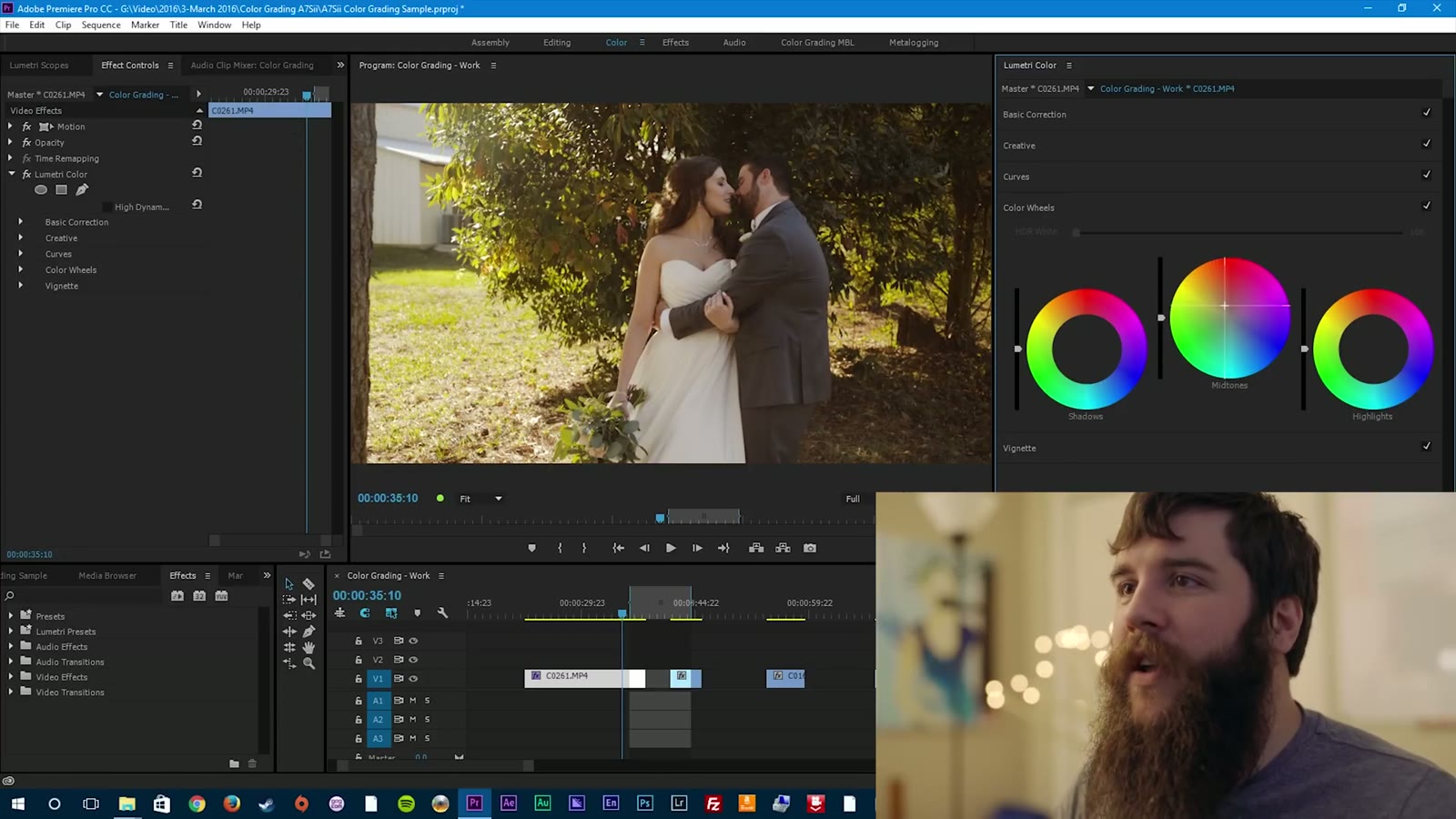
You don’t want to go too extreme here. It’s so easy to just drag it up and think looks good, but it doesn’t, it looks way too red and weird. Bring it back down. Be careful, too, because if you drag too far to the left you start getting green, and too far to the right you start getting purple. You want to land right in between those two.
Are you seeing the benefit of a calibrated monitor right about now? If you didn’t have one, you wouldn’t be able to say ah, that looks good. It’d be more like, yeah, I hope.
Shadows: Where It’s Easiest To Ruin Everything
Next up are the shadows, and you want to be really careful here, because it’s really easy to wreck your image fast. If I start adding blue to the shadows, immediately it puts a total tint over everything and it looks weird. Add some green and suddenly we’ve got Alien Ville. Add red and it looks like some sort of insane murder plot, which is probably not the mood you’re going for at a wedding.
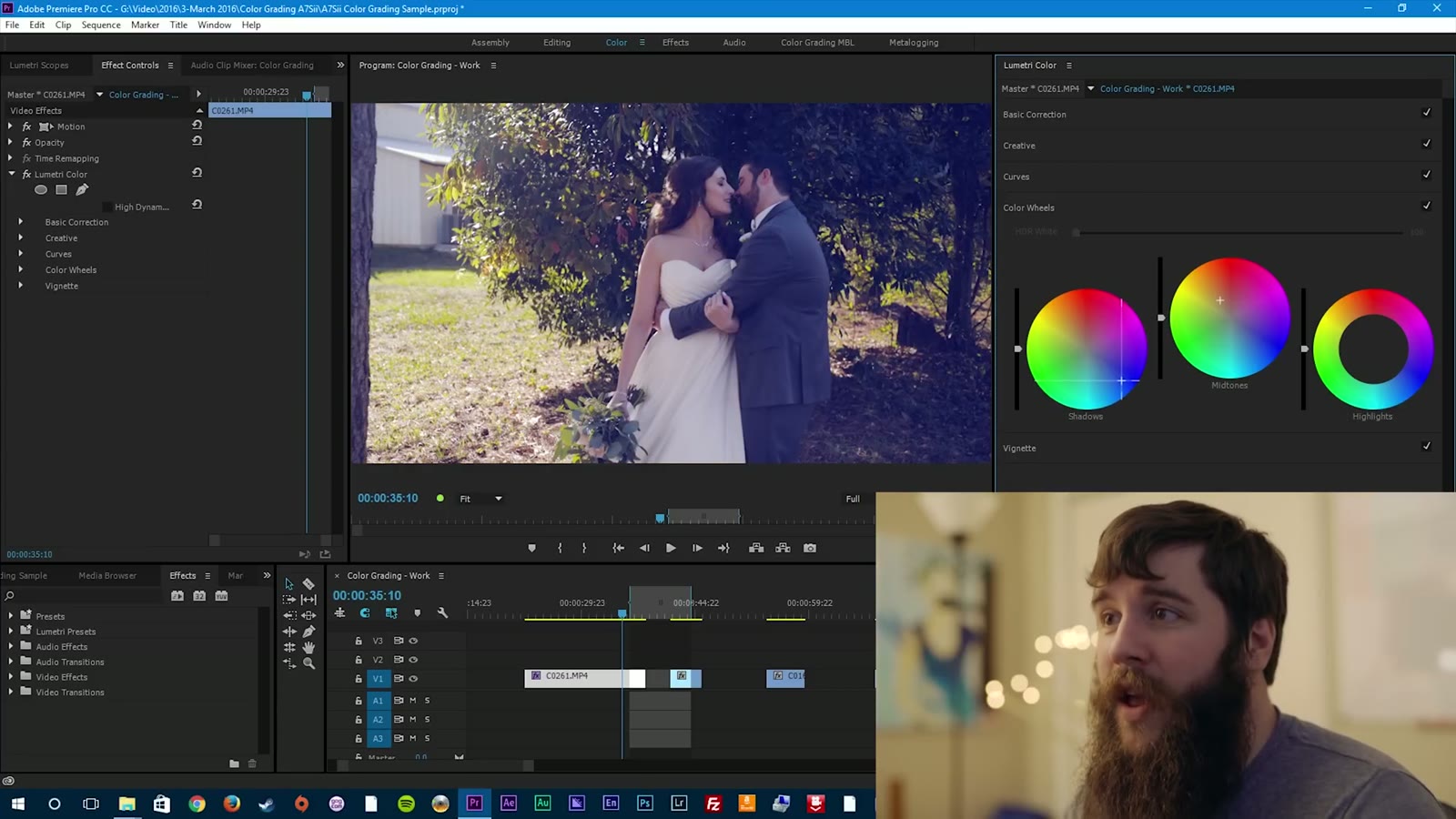
This is where complementary colors come in. A complementary color is one on the opposite side of the color wheel from the color you’re already using. So if you have warmer skin tones, maybe you want cooler shadows to make the skin tones pop out of the image. That’s exactly what we do here. Drag the shadow wheel down toward blue, just a hair, and the skin tones pop. Go too far right and you get red, too far left and you get green. It’s a very, very fine line, and a little goes a long way.
Then the highlights. Half the time I don’t even adjust the highlights, because messing with them can make very weird things happen to your skin tones and to the brightness of your image, very quickly. Usually I leave them alone, because I’ve already white balanced for the light source in the room and I know that color is good. In this shot, though, I wanted the sunlight coming in from the left to be a little warmer and more vibrant, so I pushed the highlight wheel mostly into the red, because I didn’t want that green reflection coming in.
And here’s your finished grade. Without, with. Without, with. I’d say that’s a pretty big change, but I think it looks good. One last thing I might do is bring the saturation up to about 140 to add a little extra pop without being overdone.
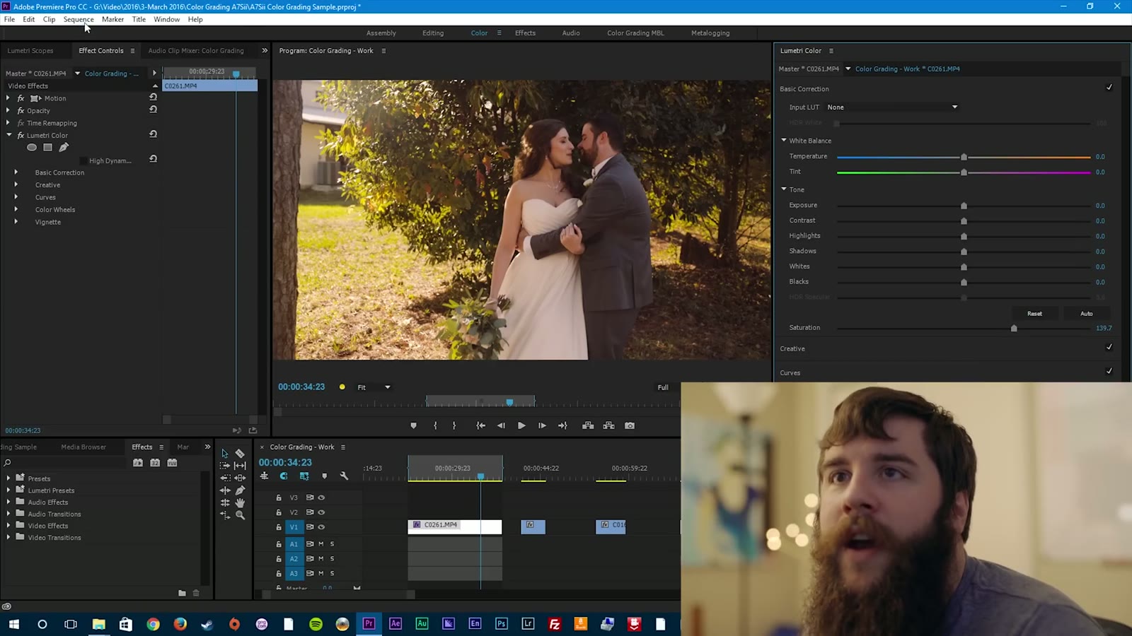
Render it out and look at it. The highlights have a nice roll off, the shadows are well exposed, the skin tones are warm. That’s a good hero shot, because I’d definitely use this shot in the video and it’s a good indicator of how the rest of the film is going to look.
Copying The Grade To Your Other Clips
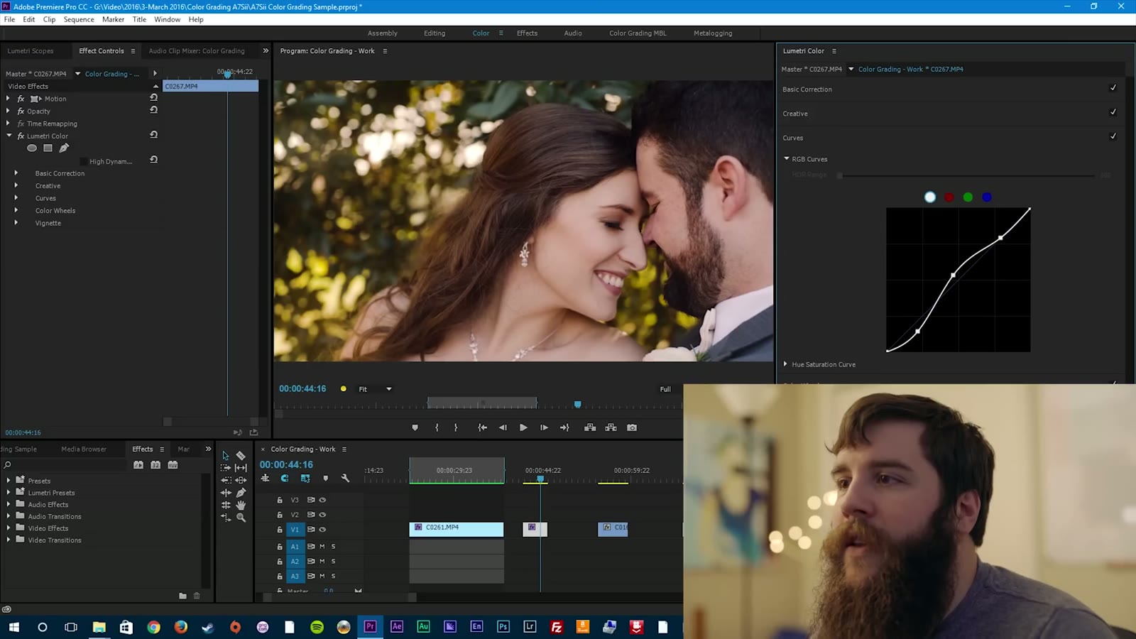
Now we need to talk about applying the grade from your hero shot to everything else. Go up to the Lumetri Color effect and hit Ctrl+C, or right click and copy, or Command+C on a Mac. Then go to the next clip you want to grade and paste.
In this case I have a close-up from the same scene, and pasting the look onto it gets me most of the way there right off the bat. It just needs a couple of tweaks. Back to curves, drop the shadows a little more to crush the blacks just a hair. Over to the color wheels, and the skin tones feel a little too red, so bring the midtones down slightly. Then adjust the highlights and see how it sits. That’s your hero shot look copied over to the second clip, and I’d say it looks pretty darn good.
A Shot That’s Completely Different
Next let’s take that hero grade and drop it on a shot that has nothing in common with it. This is Paul getting ready, and we’re in a library and study room at the venue. Lots of dark wood, and two sources of sunlight coming in through two windows, key from the left and fill from the right.
Copy the Lumetri effect, paste it onto the clip, and as you can see, it’s a little warm. So let’s tweak it down to match everything else. Go to the color wheels first, bring the midtones down until his skin tones stop looking crazy, and that’s already a whole lot better. I like the warmth coming in from the highlights, and the shadows want a little more blue.
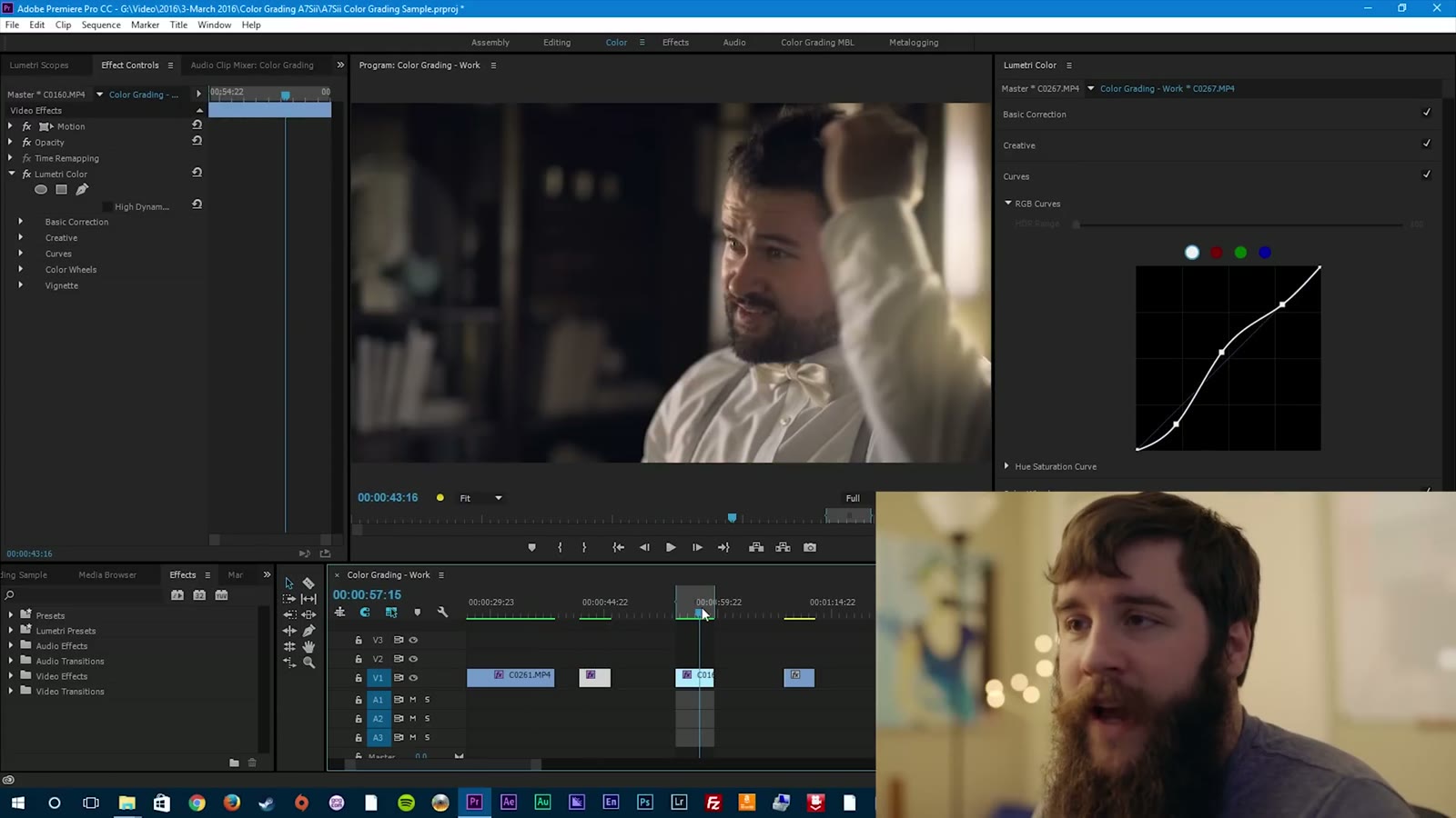
Then play with the curves. You can see how much room we have in the shadows here, so I bring those up a little, because I do like the bookshelf and I don’t want it going completely black. For the midtones I’m watching the overexposure to make sure I’m not losing any detail in his shirt, so I bring that down just a hair. And for the highlights, bring them up a little to make things pop.
Paul is looking pretty darn dapper at this point. He looks a little agonized in this scene, but he’s checking himself out in the mirror and he’s really proud of how he looks. Don’t be fooled by that face. He is incredibly excited about it.
Grading Under Artificial Light
The last one I want to show you is different from all the others, because everything up to now has been a sunlit scene with natural light. Now we’re at the reception, and unless I took them out under the moonlight, which I probably could feasibly do with the A7Sii, we are stuck with artificial lighting. We’ve got string lights hanging from the ceiling and the spotlight I bring along to every wedding to properly light the dance floor. All of it is roughly 3200K, which is a completely different world from daylight.
Copy the hero shot grade over to this clip and everything goes mighty orange, because that grade was built for the sun. So we tweak.
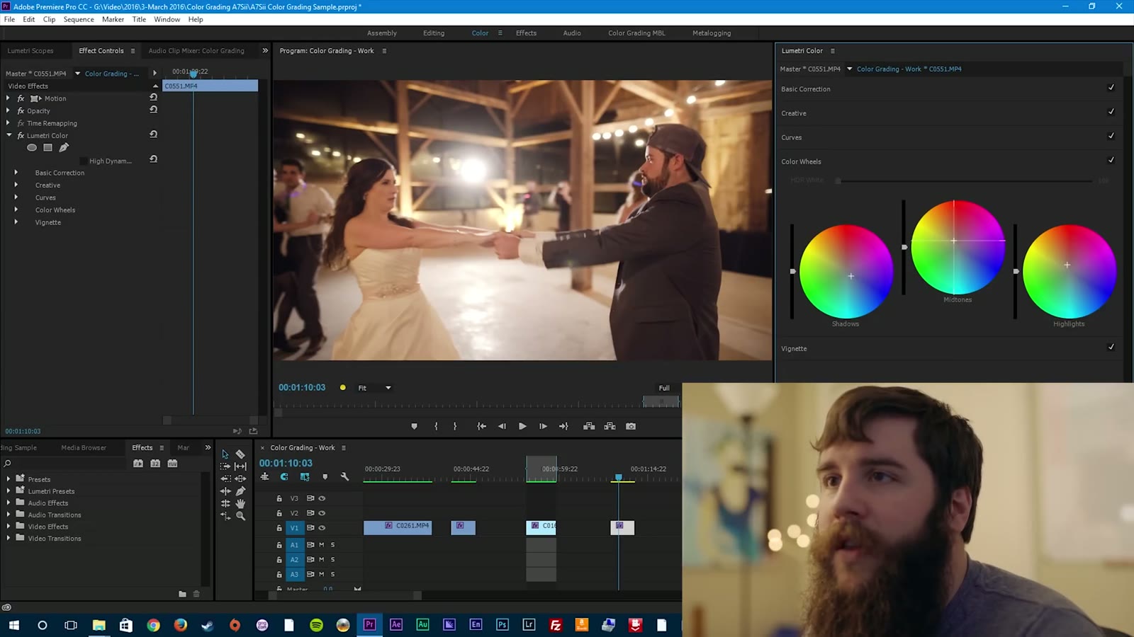
Open up the curves first. Bring the shadows down a little, leave the midtones about where they are, and be careful with the highlights, maybe lowering them slightly. Then the color wheels, which is where the majority of the change happens on a shot like this. Start with the highlights, and you’ll notice that as you adjust them, most of the change is happening on my light, because that’s the main highlight source in the image. Bring it back down toward a neutral white. Then the midtones come back down a couple of notches, but not too far, because you’ll lose the warmth in the skin. And for the shadows, leaving them up gives you a warmish, almost greenish tint that you don’t want, so bring a little more blue in.
At this point everything I’m doing is starting to look the same to me, which is the signal to step back, relax a little, and come back to it. But I think that looks pretty good. Still warm and fun, under a completely different lighting scenario.
Watch The Whole Thing Back
Play all your clips together and pay attention to how the grade matches up between them. This is one of the most crucial last steps of any color grade: watching your entire video all the way through. Whenever you do, you’ll notice things. Maybe the second clip could have used a hint more warmth in the skin tones. Maybe the last one needed a few more adjustments. But overall it holds together, and that’s the goal.
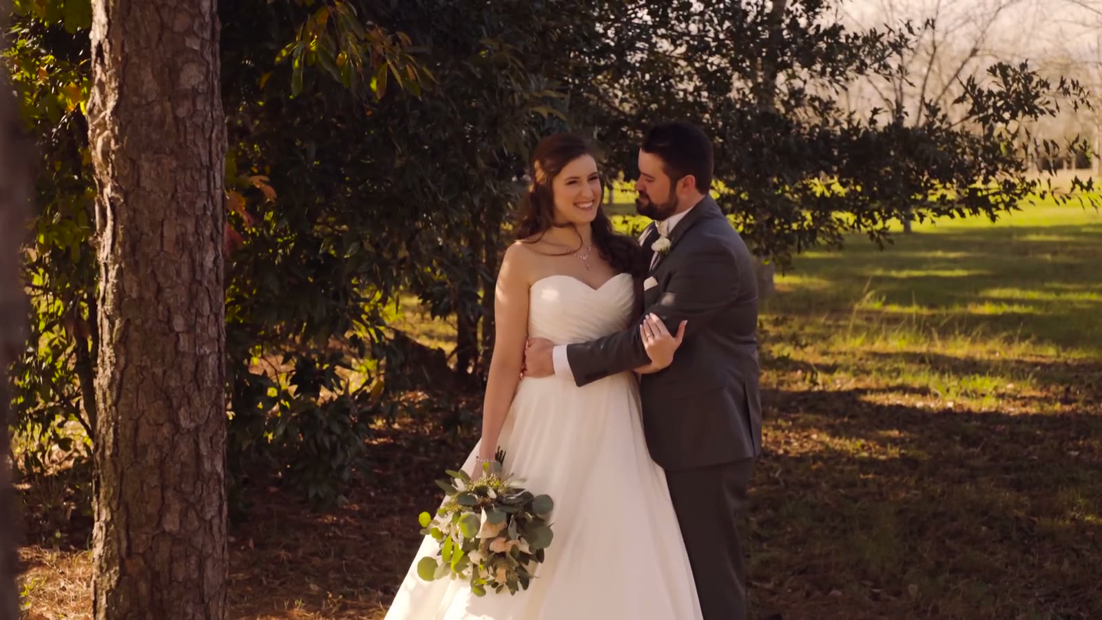
And that’s it. You just learned how to color grade your first wedding video. Granted, that’s just the basics, and we have only barely scratched the surface here.
Where To Learn More
If you want to keep going, there are two resources I recommend without hesitation. The first is the Tao Colorist Newsletter, sent out weekly by Patrick Inhofer. He goes into detail about the latest color grading technology, philosophy, tips, and tools, and it’s a genuinely great educational resource. I sit down every Sunday afternoon and read it. Patrick also runs the Tao of Color website, which has tutorials and even a full course that covers grading an entire feature film, where you sit down and grade your way through the movie and he gives you feedback at every step. That one is really awesome if you want to learn a ton.
The second is Color Grading Central by Denver Riddle. The guy is kind of a legend in the color grading community. He has a ton of free tutorials on his YouTube channel, and he makes plugins and LUTs you can buy and use on your own footage. Now if he would only make some plugins for Premiere Pro. 🙂
The Next Step: Grading With LUTs
At the end of this video I promised a follow-up all about lookup tables, or LUTs, and how you can use them when grading your footage. That video exists now, and it walks through a lot of the same ground as this one, except you apply a LUT at the start and then tweak from there to get a great looking image. You can watch it here: How to use LUTs to color grade A7Sii, FS5, and a6300 footage in Premiere Pro CC.
Years after this tutorial I ended up making my own set of LUTs, and I also remade this whole workflow for the newer Sony cameras and picture profiles. If you’re shooting on something more recent than an A7Sii, those are the ones you want:
- How to easily color grade Sony a7S III LOG footage without LUTs in Premiere Pro, which is this exact philosophy applied to SLOG3
- WhoisMatt LUTs for the a7S III, Canon R5, and more, available at whoismatt.com/luts
Want To Watch More?
- My favorite picture profile for the Sony A7Sii and FS5, which is the video you should watch before this one
- A wedding filmmaker’s review of the Sony A7Sii
- A wedding filmmaker’s review of the Sony FS5
- How wedding cinematographers and photographers can get along
- Katelyn and Paul’s wedding film, which is where all the footage in this tutorial came from
If you have any questions or comments about color grading or anything else relating to wedding cinematography, please get in touch. You can also see my wedding films at Filmstrong Productions, and follow along on Instagram.
A note on timing: this tutorial was filmed in March 2016 using the 2015.2 release of Premiere Pro CC. The Lumetri panel has picked up a lot of features since then, and the panel layout has moved around, but curves and color wheels work exactly the same way they did here, and so does the philosophy.