
You’re sitting at the theater watching the latest Michael Bay film when you realize, “I wish my wedding films had an over-saturated bride and groom fighting giant robots!” Well I have good news for you, I can help with one of those things. And no, it’s not CGI giant robots, you’ll have to learn Cinema 4D for that. What I can help you with is using a Look Up Table, or as it’s known on the street, a LUT, to color grade your wedding films and make them look awesome.
What Is A LUT?
In the simplest terms, a LUT is a preset file that contains color, contrast, brightness, and saturation information in the .cube format. LUTs get used for a lot of reasons, including simulating film stock looks, emulating camera colors, and even color calibration. What we’re using them for today is as a starting point for your color grade. It saves you a lot of time, and it lets you explore colors you might never have thought to try.
What Is Not A LUT?
A LUT is NOT a one click color grade for your film. You can’t just slap one on and render out. LUTs often don’t take your white balance and exposure into account, so you’re still going to color grade. The difference is that you’ll be doing a lot less of it than you would starting from scratch.
The way I think about it: a LUT is training wheels for the rest of your grade. It gets you halfway there, maybe sixty percent of the way there, and then color grading gets you the rest of the way.
Watch These Two First
Before you go any further, I’d really recommend two of my previous videos. First, My Favorite Picture Profile for the Sony A7Sii, FS5, and a6300, because that’s the picture profile I’m shooting with here and it’s the one these LUTs are matched to. Second, How to EASILY color grade Sony A7Sii, FS5, and a6300 footage using Premiere Pro CC, because I cover a pile of basics in there that I’m building on top of in this one, including the curves and color wheels I use throughout.
You’ll also need Premiere Pro, and Adobe has a free trial of the full Creative Cloud suite if you don’t have it.
Which LUTs I Recommend
There are a butt-ton of LUT options out there. Here’s where I’d start:
- My own WhoisMatt LUTs
- IMPULZ LUTs, which look great and come in versions for a lot of different cameras. Try the basics, and if you like them, look at the Professional or Ultimate packs.
- White In Revery’s LUTs
- James Miller’s DELUTS, which is what I’m using in this tutorial, specifically his Cine4 set.
What you ideally want is a LUT made for your camera and your picture profile, so you don’t have to finesse it too much afterward. That’s the whole reason I’m using the Cine4 set here.
A Note On Cine4 And S-Log3 LUTs
I shoot the Cine4 picture profile, which I learned about from Marien Breithouwer, who is super talented. One of the benefits he mentioned is that Cine4 can use both S-Log3 LUTs and Cine4 LUTs when you’re grading.
I have not found that to be true in Premiere. He’s cutting in Final Cut Pro X, so it may genuinely behave differently over there, but whenever I try to grade Cine4 footage with an S-Log3 LUT in Premiere it comes out contrasty and weird and I haven’t worked out how to match the levels properly. So I use LUTs made specifically for Cine4 and they work very well. If I ever crack the S-Log3 side of it in Premiere, I’ll make a video about it.
Start With Your Hero Shot
Everything from here is in Premiere. I’m going to assume you know how to import footage and build a timeline, and we’re going to pretend you’ve finished editing and you’re ready to start grading.
Go through your footage and pick your hero shot. That’s your favorite shot, the one that best exemplifies the film, the one with a good spread of shadows, midtones, and highlights. If I can make that shot look good, I want the rest of the film to look as good as that.

Go to the Color tab at the top, which brings up the whole Lumetri Color panel: Basic Correction, Creative, Curves, Color Wheels, Vignette. Curves and Color Wheels are covered in the previous video. The tab we didn’t touch last time is Creative, and that’s where the LUT goes.
Browsing LUTs With The Arrow Keys
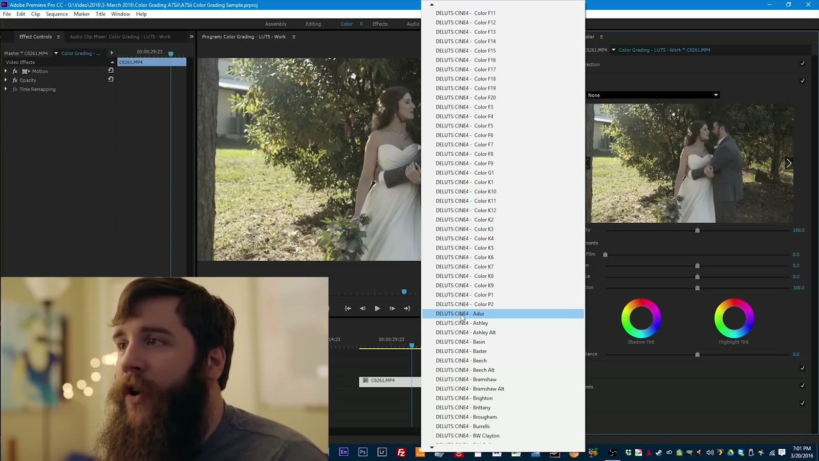
Once you’ve bought your LUTs and followed the installation instructions, the Look dropdown at the top of Creative fills up with a whole buttload of options. Some are Adobe’s own built-ins. Scroll down past those and you’ll start seeing your pack by name.

Click the first one and it applies instantly to your preview. This is the part most people miss: you don’t have to open that dropdown again. There are little left and right arrows next to the Look field, and you can just tap through the entire pack one LUT at a time, watching your hero shot change with each press.

So that’s what I do. Too washed out. Next. That one looks like a war movie. Next. Ooh, that’s moody, but I don’t really believe in mixing black and white into a wedding film. Next. With a hundred LUTs in a pack, tapping through them takes a minute and you’ll know a good starting point the moment you see it. I landed on one of the higher contrast alternate versions, because I wanted the colors to actually pop rather than sit back flat.
Back Off The Intensity

Right under the Look field is an Intensity slider, and this is the single most useful control in the whole panel. Drag it to zero and the LUT may as well not be there. Drag it up and you get eye bleeding levels. On this shot the LUT was a little strong at full, so I backed it off to about 70 percent. There’s no correct number, it’s your call on your footage.
Then down to Curves. Honestly the LUT had already put a good curve on this image, but I brought the midtones up just a hair and pulled the highlights down a little, and that started looking pretty good.

Then Color Wheels. I liked how warm it was but I wanted a little more gold in the midtones, so I nudged those, nothing extreme, because it’s already warm and you don’t want to go crazy. Highlights up a touch so the sun shining in goes a nice golden color. Then shadows very slightly toward blue, the complementary color to that orange yellow.
Toggle the effect off and back on. That’s a big difference. Imagine watching that versus watching that. It’s a completely different feel to the film.
Copy The Grade To Everything Else

With the hero shot done, copy the Lumetri Color effect and paste it onto the next shot. On the close-up of the couple it looked great straight from the copy. I dropped the shadows slightly in Curves to bring the hair down a bit, and pulled the midtones down a touch so the faces weren’t glowing, because we don’t want glowing faces. Then a small skin tone adjustment in the wheels and I was happy.
Notice how much less work that is than grading each shot flat from scratch. That’s the whole payoff.

Next up is Paul indoors getting ready, looking dapper. Copy, paste, and oh, that is downright vintage old timey. Way too intense. So back to Creative, intensity down to about 50 percent, which takes the harshness off that red, then pull a little warmth out of the midtones in the wheels and he looks naturally colored again instead of on fire. A little curve work to bring detail back into the side of his face and that’s a match.
Sometimes when I’m doing this and talking at the same time I feel like Bob Ross. We’re gonna paint some happy trees here. Very, very subtle. Don’t go extreme.
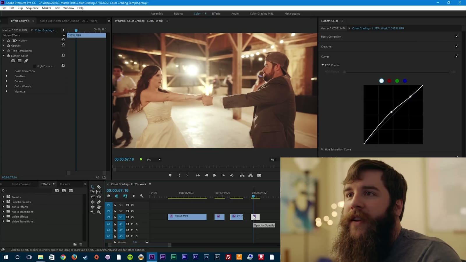
Last clip is the nighttime reception dancing, all artificial light. Copy, paste, and same thing happens as with the indoor shot: way more orange and red than you want. Intensity back down to 50. Reset the color wheel, bring the highlights back up just a little warm, then push the midtones ever so slightly toward blue, which pulls the skin tones back so nobody looks like a traffic cone. Drop the shadows a hair in Curves, leave the midtones where they are, done.
Quick shortcut I should have used: instead of pasting the hero shot grade onto the reception clip and fixing it all over again, I could have pasted the grade from the indoor shot, which had already been corrected for artificial light. Same problem, same fix, one step instead of two.

Play it all back to back and everything matches. Good job, LUTs.
Final Thoughts
The real benefit of a good LUT pack isn’t any single look, it’s that you get a hundred different starting points. Pick one, start grading, and dial in exactly the image you’re after. With a good LUT you have an amazing head start on a good color grade, and with a little tweaking you can make it your own. Just don’t expect them to do the work for you.
Want to watch more? Here’s my review of the A7Sii, my review of the FS5, the picture profile these LUTs are built for, how I color grade that profile from scratch, and a tip for how wedding filmmakers and photographers can get along.
If you want to go deeper on the editing side, my wedding film editing course is here, and here’s all my favorite filmmaking gear.
The music licensing sites I recommend are Soundstripe (use the code WHOISMATT for 10% off a yearly or monthly subscription), Artlist (two extra months free), and Musicbed.
This was filmed in April 2016 in Premiere Pro CC 2015.2, so the Lumetri panel has moved around a little since and the Look dropdown looks different in current versions. The workflow is unchanged: pick a hero shot, arrow through the pack, back off the intensity, then finish by hand.
I’m required to state that I’m part of affiliate programs for Amazon, B&H, Soundstripe, Artlist, Musicbed, and Adobe, and that some of the links above are affiliate links.