It’s finally here. A ton of you have been asking me to make this one for a while, so here is the exact color correction and color grading workflow I use on my Mavic Pro footage, including how I use LUTs and one free LUT I really like.
Two things to watch first. I made a whole video on my Mavic video settings, picture profile, gimbal speed, ND filters, all of it, and the clip I’m grading here was shot with those settings. Go shoot something with them and follow along, otherwise you’ll be sitting there thinking this looks flat and weird because it was shot differently. I also made a basic color grading video, and I skip over a lot of the fundamentals here because I already covered them there.
Everything below is in Adobe Premiere Pro CC 2017. If you need it, there’s a free trial.
Start With Color Correction
Here’s the clip. Shot in Iceland at 30fps conformed to 24, in D-Log, straight out of the camera with nothing applied.
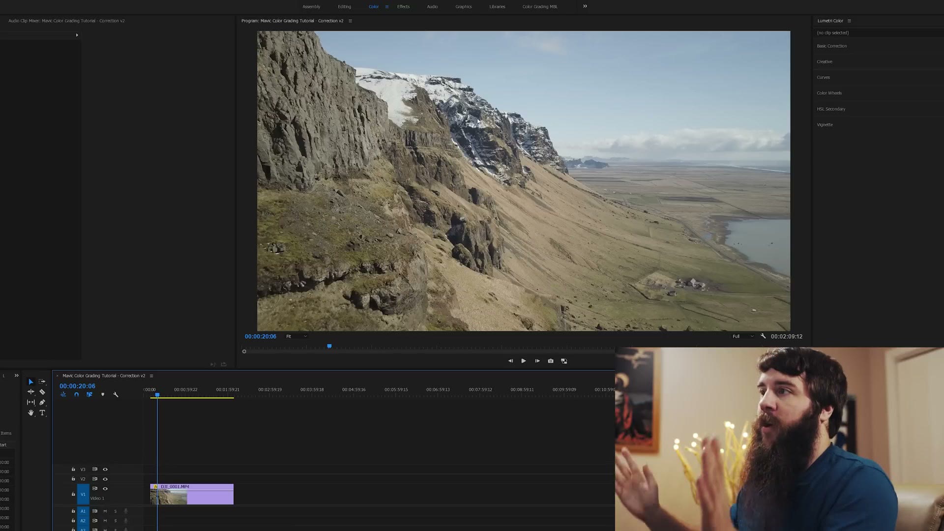
Before anything else, I want to bring this back into Rec.709. That means as contrasty and saturated as what you’d normally see on a TV. Log gives you a ton of room to grade, but it is not something you show anyone and say “look at this beautiful video I shot,” because it looks flat and gross.
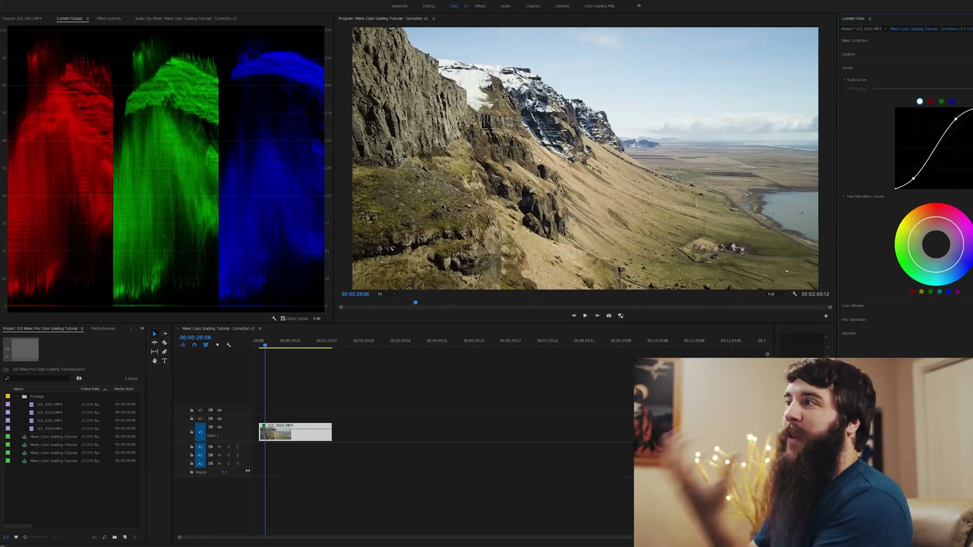
Select the clip, go to the Color tab, and open both the Lumetri Color panel and Lumetri Scopes. I keep my scopes on RGB Parade, which looks like some kind of modern art piece but shows you exactly how bright and dark your image is in each of the three color channels.
Adjusting Curves
Look at the parade on a log clip. Everything is squished into the middle, topping out around 90 and bottoming out around 10. The job is to stretch that out so it runs from near zero to near 100.
Click into a shadowy area of the curve and pull down, watching the scopes drop. Then make a point up in the highlights and drag up. You’re watching two things at once: the scopes stretching out, and the image itself, so you stop before anything clips. Blacks black, whites white, nothing overexposed.
Bringing Up Saturation
Go to Basic Correction and pull the saturation slider up to about 120. There are a dozen other ways to do this and this is the easiest one. Much past 120 and it starts going super green and super blue and looks oddly unnatural. For D-Log I find 120 is about right, especially with Iceland where everything is fairly gray and flat to begin with. If you’re grading something else, 130 or 140 is fine.
Applying Color Corrections
At this point there isn’t much left to fix, because I had white balance and exposure nearly nailed in the air. That is the whole point of getting it right in camera.
The one thing I want to tweak is that the midtones are reading a little blue, especially off in the distance where the haze is. So I go to the color wheels, grab the midtones wheel, and drag ever so subtly up and to the left into the oranges. You can watch the red, green and blue channels move in the scopes as you do it. The grass goes from blue-ish to a natural yellow. Then the greens start looking a touch too yellow, so I ease it back.
Everything in color grading is tiny movements. You do not want to go crazy.
The Magenta Shift
One thing worth knowing about DJI drones in general: they tend to shift a little toward magenta, that sickly red-purple between red and purple on the wheel, and it usually lands in your midtones.
I’m not seeing much of it here because I nailed the white balance and I’m shooting D-Log with their latest color science. But if you’re in D-Cinelike, or the normal picture profile, or anything else, you will probably see it. The fix is to take the midtone wheel down toward green, the complementary direction. Go too far and you get a gross Wizard of Oz look, so keep it subtle.
Correcting Versus Grading
Color correction is making the image look right. Color grading is manipulating color, contrast, saturation, hue and vibrance to change how your viewer feels.
Say the film is sad. Take the midtones colder, take the shadows colder, then pull the shadow brightness down. Suddenly Iceland looks foreboding and you’re not sure you want to visit.
Now say it’s a family vacation instead. Push the midtones a little warm, then push the highlights warm too so the white clouds go slightly yellow-orange, which mimics sunlight. Same footage, completely different film. That’s a huge swing in emotion from two tiny moves.
Using A LUT
If you want something more extreme without doing all that work, LUTs are lookup tables that manipulate the colors in your image, already built by someone else. The one I’m using here is called Sedona and it’s a free LUT from IWLTBAP.
Delete your Lumetri Color entirely first so you’re back to the flat log image. A LUT should be the first step, not something you bolt on top of a grade. Then go to the Creative tab, click the Look dropdown, and Browse.
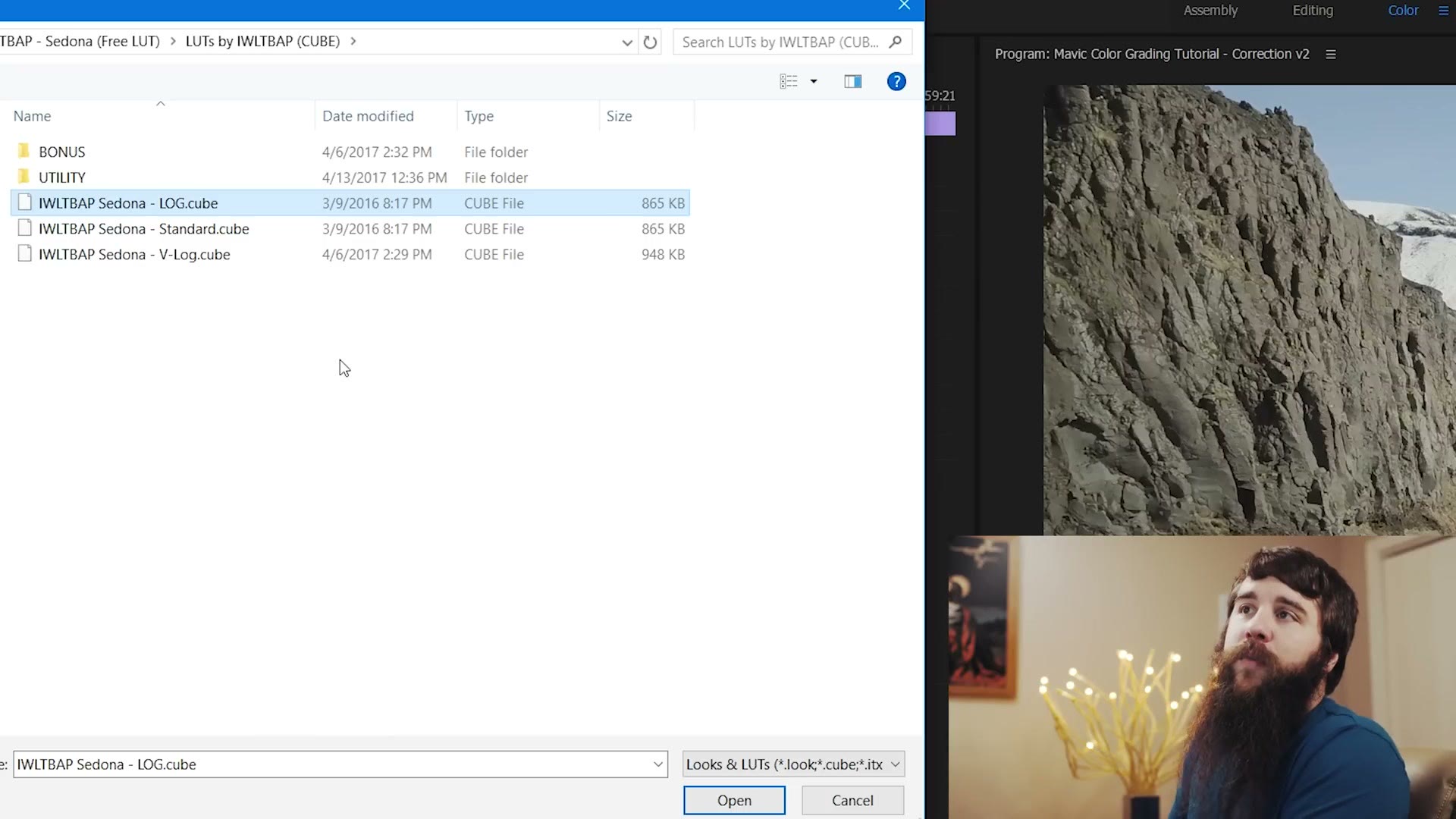
Pick the LOG cube, not the Standard one. The LOG version is the one built to be applied to a log format like D-Log, and .cube is the format Premiere reads.
The change is immediate. It strips out a lot of the green and gives you strong reddish orange and bluish teal, which is the Hollywood blockbuster look as they call it. I like it, but out of the box it’s too strong: the shadows are crushed and there’s nothing happening up in the highlights.
So, two fixes. Drop the Intensity slider to around 70%, which is where I land on most LUTs. Then go back to Curves and pull the highlights up until things are bright but not clipping, and bring the midtones down a touch if they got high in the process.
That is really all grading with a LUT is: find one whose color you like, then push the levels around until it fits your footage.
The Two Looks Side By Side
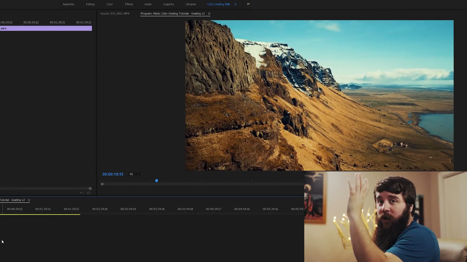
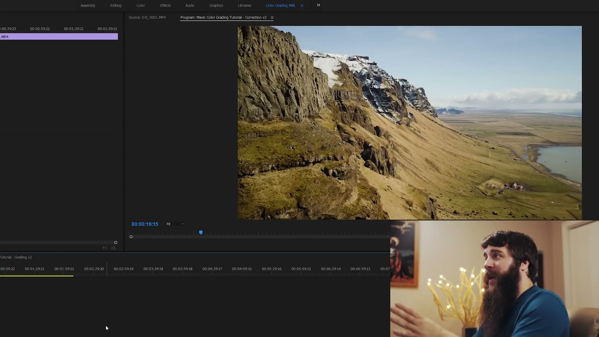
The LUT version is colder and starker, and it has pulled the greens out of the moss and the grassland and shifted them into yellows and reds. It’s more of a two-note look, blues and oranges. The corrected version keeps all that green.
Honestly, either one works. It depends entirely on what you want the footage to say.
More Drone Stuff
I have a pile of other Mavic videos, including my full review of it as a wedding filmmaker and how to study for and pass the FAA Part 107 test, which you need if you want to fly commercially. All my drone gear is in this kit.